How to Craft a Powerful Call to Action (CTA)

Making a strong impression online isn’t just about flashy designs or clever headlines. In the end, what really matters is getting people to do something. That’s where your CTA comes in.
So, in case you’re trying tо get someone tо click a link, sign up for a newsletter, оr complete a purchase, a well-placed and well-written CTA can make all the difference. It’s just a few words, sure, but when used right, those few words can boost your clicks, sign-ups, and sales like nothing else.
What is a Call to Action (CTA)?
A call tо action, оr CTA, іs simply a prompt that tells your audience what you want them tо dо next. It’s that small but mighty piece оf text you often see оn buttons, banners, pop-ups, emails, and landing pages.
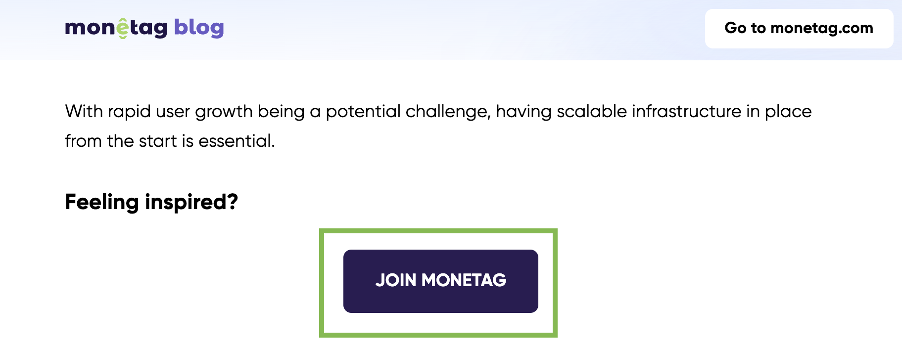
Here is one example from the Monetag blog:

But a CTA is much more than just a few words. It’s a critical part of your marketing funnel. Without a clear CTA, even the best-designed page or the most persuasive ad can leave users wondering, “Okay, now what?”
In short, a good call to action acts like a friendly nudge, guiding visitors toward the action you want them to take.
Why CTAs Matter: The Power of a Few Words
You might think a call to action is just a small part of your ad or landing page, but it actually plays a huge role in whether or not users take the next step.
A strong CTA can mean the difference between someone bouncing off your page, becoming a lead, subscriber, or customer.
CTAs work because they eliminate confusion. They give people a clear next move and create a sense of urgency or excitement. Without a good call to action, even highly interested visitors might hesitate or lose focus.
if you’ve already grabbed someone’s attention with your offer, why leave them guessing about what to do next? A well-placed, persuasive CTA keeps momentum going and moves users further down your funnel.
In short, CTAs don’t just boost clicks or conversions. They make your entire marketing message feel complete.
How to Write a Call to Action That Actually Works
Writing a call tо action isn’t about sounding clever, it’s about being clear, direct, and a little bit persuasive. If your CTA leaves users wondering what happens next, you’re missing a huge opportunity.
Here’s how to make your CTA work:
- Be specific: Generic CTAs like “Click here” or “Learn more” don’t tell users what they’re actually getting. Instead, use action-driven phrases tied to a clear benefit. Think “Download Your Free Guide” or “Start Earning Today.”
- Create urgency: Adding a little time pressure can help nudge users into action. Words like “Now,” “Today Only,” or “Limited Spots” make your CTA feel more immediate.
- Match the user’s intent: A CTA for a free trial should sound different from one asking for a big purchase. Always match the tone and ask where the user is in their journey.
- Keep it short and sweet: A good CTA is quick to read and easy to understand. Ideally, it’s no more than 4–6 words.
- Use strong verbs: Words like “Get,” “Start,” “Download,” “Join,” and “Discover” give your CTA energy and make users feel like they’re gaining something.
Small tweaks can make a huge difference. In fact, some A/B tests have shown that simply changing one word in a CTA button can boost conversions by up to 30%.
Call to Action Examples: Good vs. Bad
Not all CTAs are created equal. Some inspire users to act immediately, while others get ignored completely. To really understand the difference, let’s look at a few examples:
Bad CTA Examples:
- “Click Here”
- “Submit”
- “Learn More”
These aren’t technically wrong, but they’re vague and uninspiring. They don’t tell the user why they should click or what they’re getting in return.
Good CTA Examples:
- “Get Your Free Trial Today”
- “Download Your Starter Kit”
- “Start Your Free Account in 2 Minutes”
- “Find Your Perfect Plan Now”
These CTAs are specific, action-oriented, and promise something valuable. They also hint at what happens next, reducing any hesitation users might have.
Quick tip:
When crafting your CTA, always focus on the value the user will gain. It’s not about what you want them to do, it’s about what they’ll get out of it.
Where to Place CTA Buttons for Maximum Impact
Even the best-written CTA won’t drive results if users never see it. Placement is just as important as wording when it comes to getting clicks and conversions. Here’s where CTA buttons usually perform best:
- Above the Fold: Placing a CTA at the top of a landing page ensures visitors see it immediately, without needing to scroll. This is especially effective for time-sensitive offers.
- At Natural Breakpoints: Insert CTAs after a user finishes a key piece of content, like at the end of a blog post or below a product description. This way, the user feels naturally guided to the next step.
- In the Middle of Content: Strategically placing CTAs inside your content can capture users who are already engaged but might lose focus if they have to scroll back up.
- Exit-Intent Popups: When someone is about to leave your page, an exit-intent pop-up with a strong CTA can sometimes save the conversion. A compelling offer like “Wait! Grab 10% Off Before You Go” can make a difference.
- In Email Marketing: In emails, CTAs usually perform best when they’re placed both early (near the top) and once again at the bottom after explaining the offer. Clear and repeated CTAs improve the chances of getting a click.
- Pro Tip: Don’t clutter the page with too many CTAs. Focus on one primary action you want the user to take, and make it obvious.
How Better CTAs Have Boosted Real Campaigns
Sometimes, a few small changes in your call to action can drive surprisingly big results. Let’s take a look at a few real-world best call-to-action phrases where tweaking a CTA made all the difference:
Example 1: Button Text Change Increases Conversions by 21%
An e-commerce brand once tested two versions of call-to-action buttons.
- Version A said: “Buy Now”
- Version B said: “Get Your Free Trial”
By focusing on the user benefit (getting something free), Version B boosted signups by 21%.
Takeaway: Instead of simply telling users what to do, show them what they get out of it.
Example 2: Adding Urgency Leads to 15% More Clicks
A software company changed its CTA from “Start Today” to “Start Your Free Trial Now” and saw a 15% lift in conversions. Adding the word “Now” created a sense of urgency that encouraged immediate action.
Example 3: Personalized CTAs Outperform Generic Ones
A B2B company tested a personalized CTA (“Get Your Custom Plan”) against a generic one (“Learn More”). The personalized version generated 42% more clicks because it felt more tailored to the visitor’s needs.
What We Can Learn:
- Focus on benefits, not actions.
- Add urgency when appropriate.
- Personalization can seriously boost engagement.
The right CTA isn’t just about using strong verbs; it’s about creating the right emotional response at the right time.
Conclusion
A strong call to action (CTA) isn’t just a nice extra, it’s the heartbeat of any successful campaign. Without a clear next step, even the most persuasive ad, email, or landing page can fall flat.
Understanding what is CTA in marketing, how tо write a CTA that resonates, and where tо place CTA buttons can make the difference between a passive reader and an active customer.
If you want your campaigns to perform better, don’t leave your CTA as an afterthought. Test it, tweak it, and treat it like one of the most important elements in your marketing toolkit. Because in reality, it is.


